Art Direction, Brand Design & Development. Artifacts for connection.
Amarti
Rebrand; Packaging
Industry: Restaurant
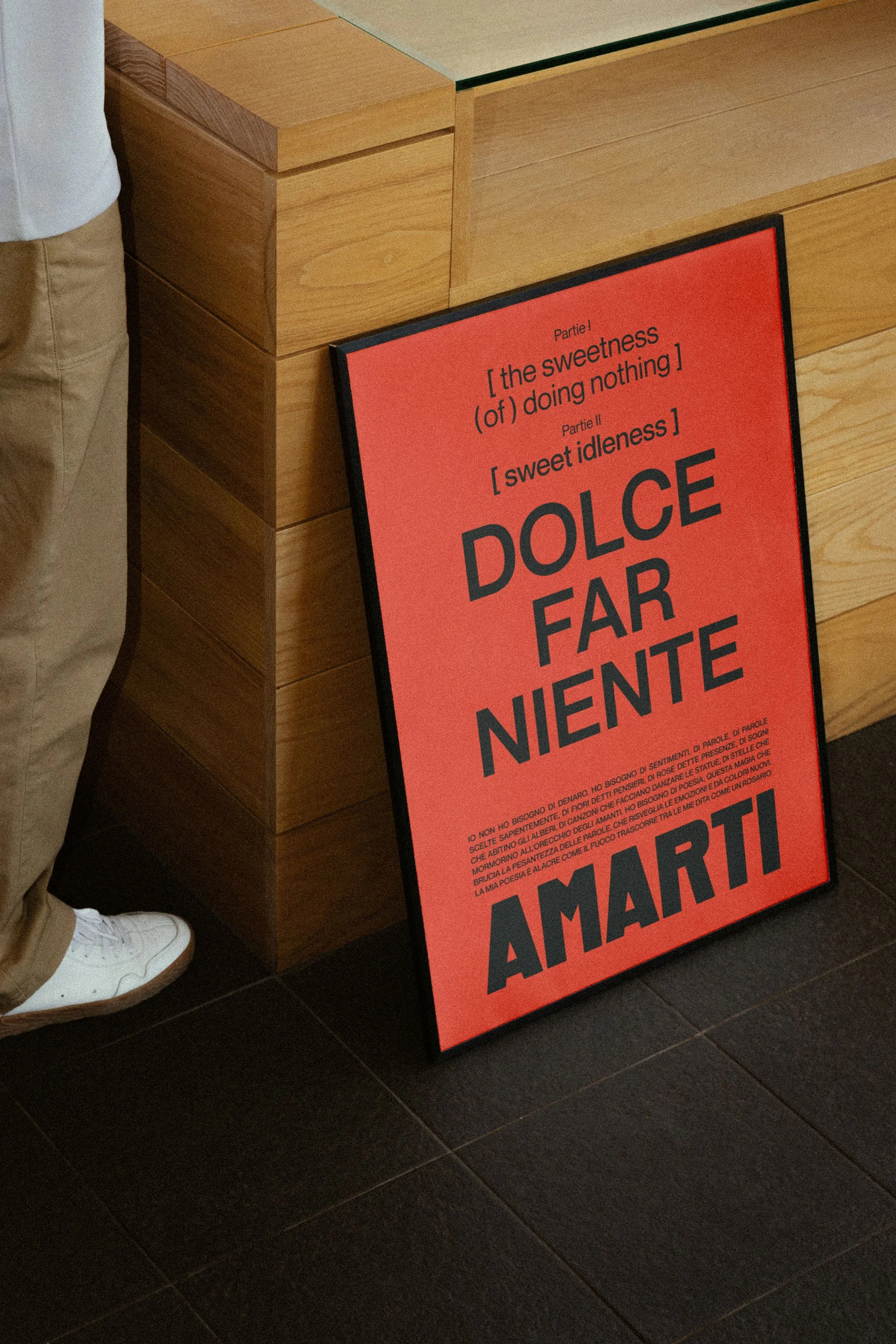
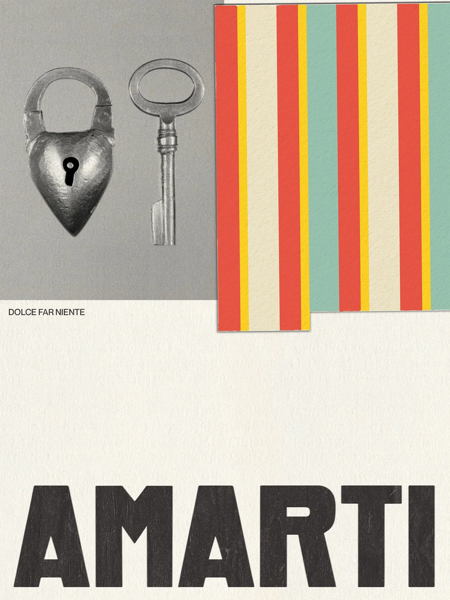
Love letters, clippings, lido umbrellas, sincere imperfection—Amarti’s rebrand identity is shaped by the meaning of its name ‘to love you’ and the Italian sentiment Dolce Far Niente, meaning ‘the sweetness of doing nothing’.
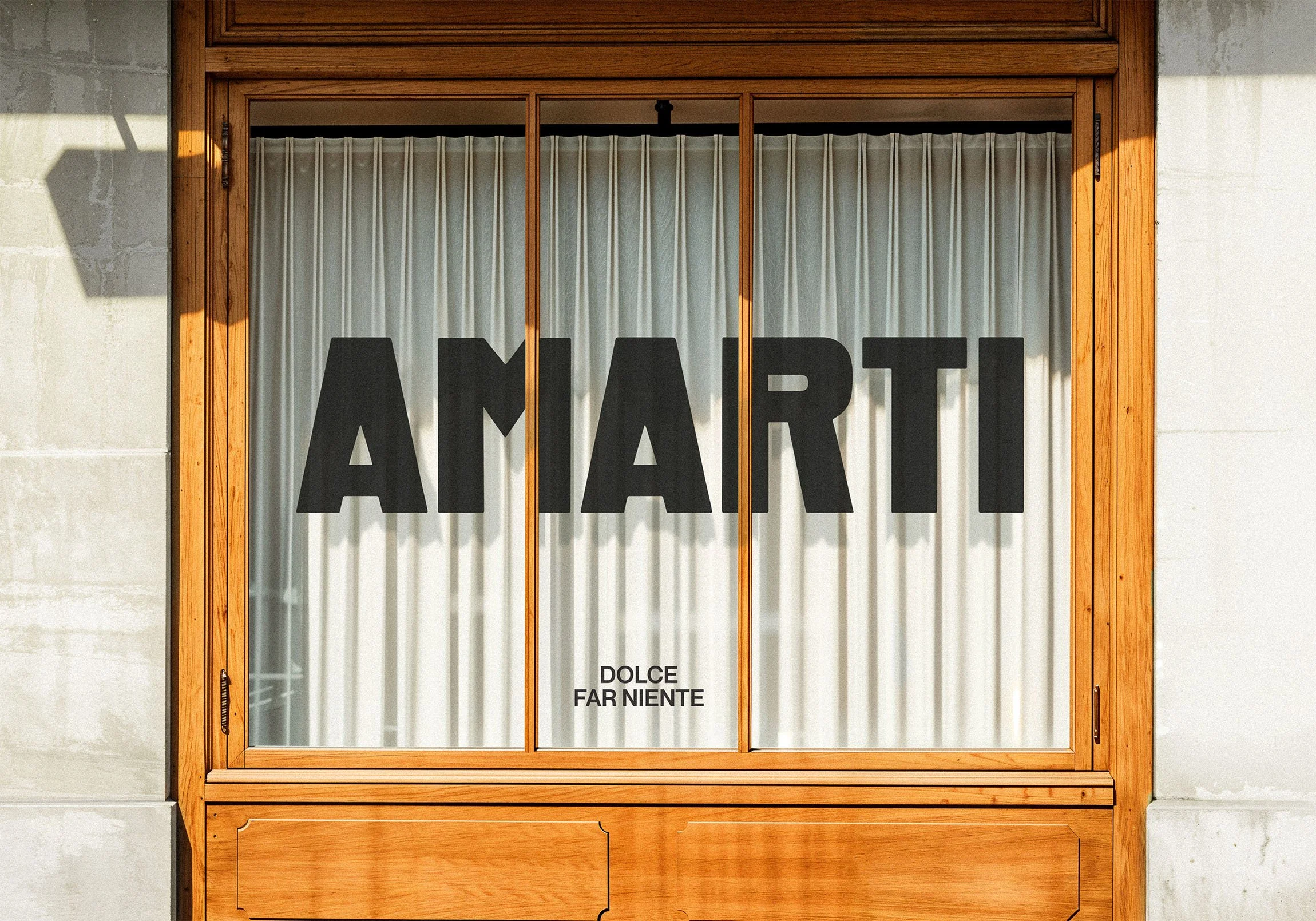
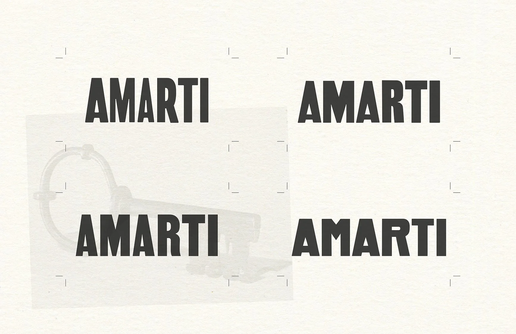
Amarti’s new logo is a collection of purposefully mis-matched and tailored characters that don the artistic confidence and endearing imbalance of hand-painted Italian storefronts.
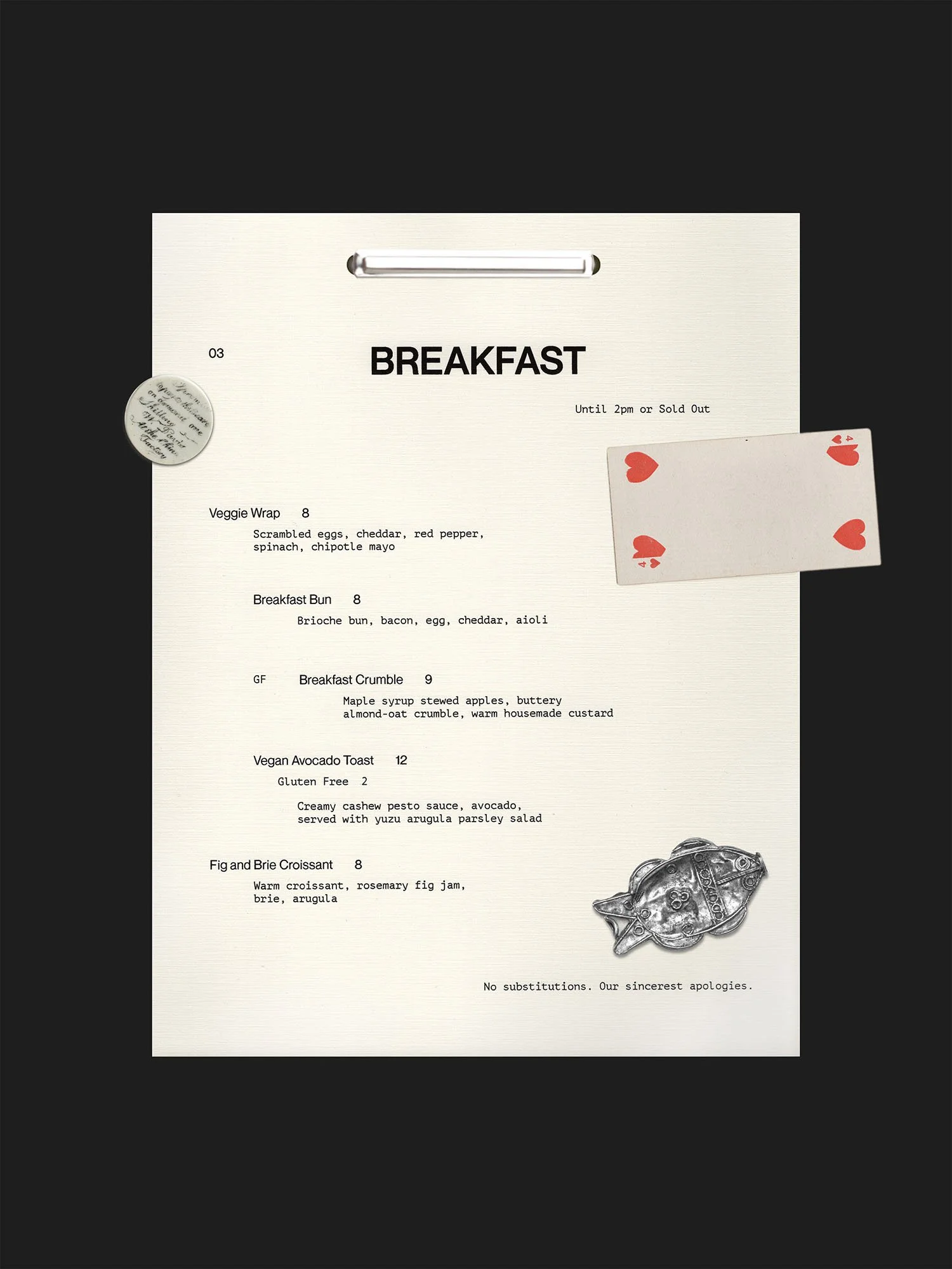
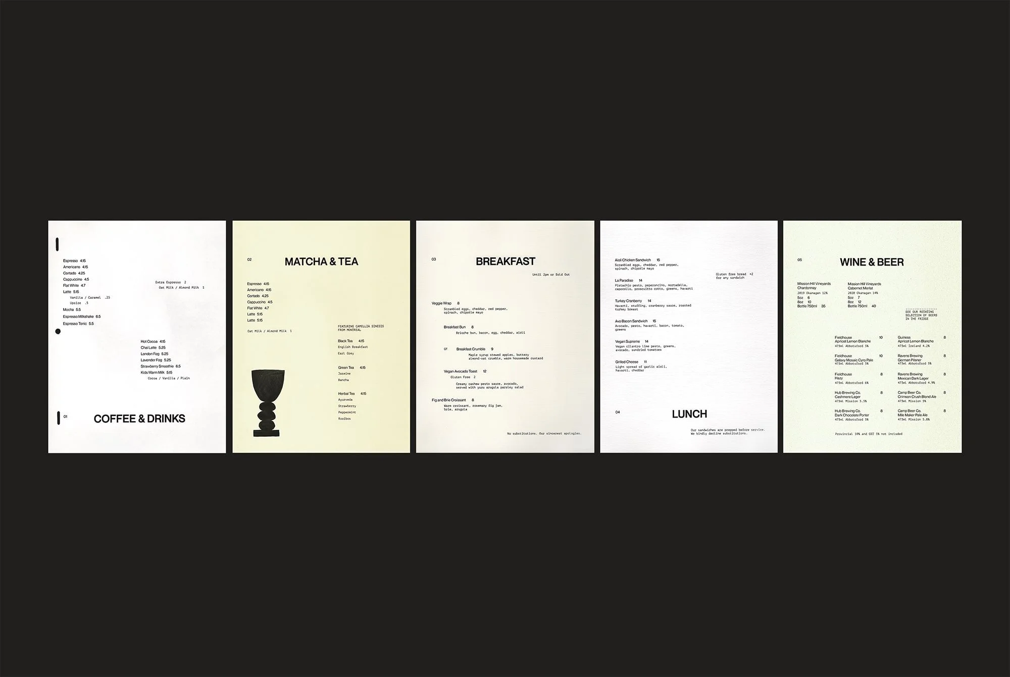
Poetry in arrangement forms the basis of the typographic approach—leading with romanticism, built from a strong grid with a hint of modern irreverence. Menus are printed on mismatched vintage sourced stationery to echo the act of letter writing.
Hand-crafted illustrations balance humour (which the Amarti staff are known for) with form inspiration from the likes of Picasso and Miro, to serve as symbols of love, conversation, neighbours, and moments for sharing.
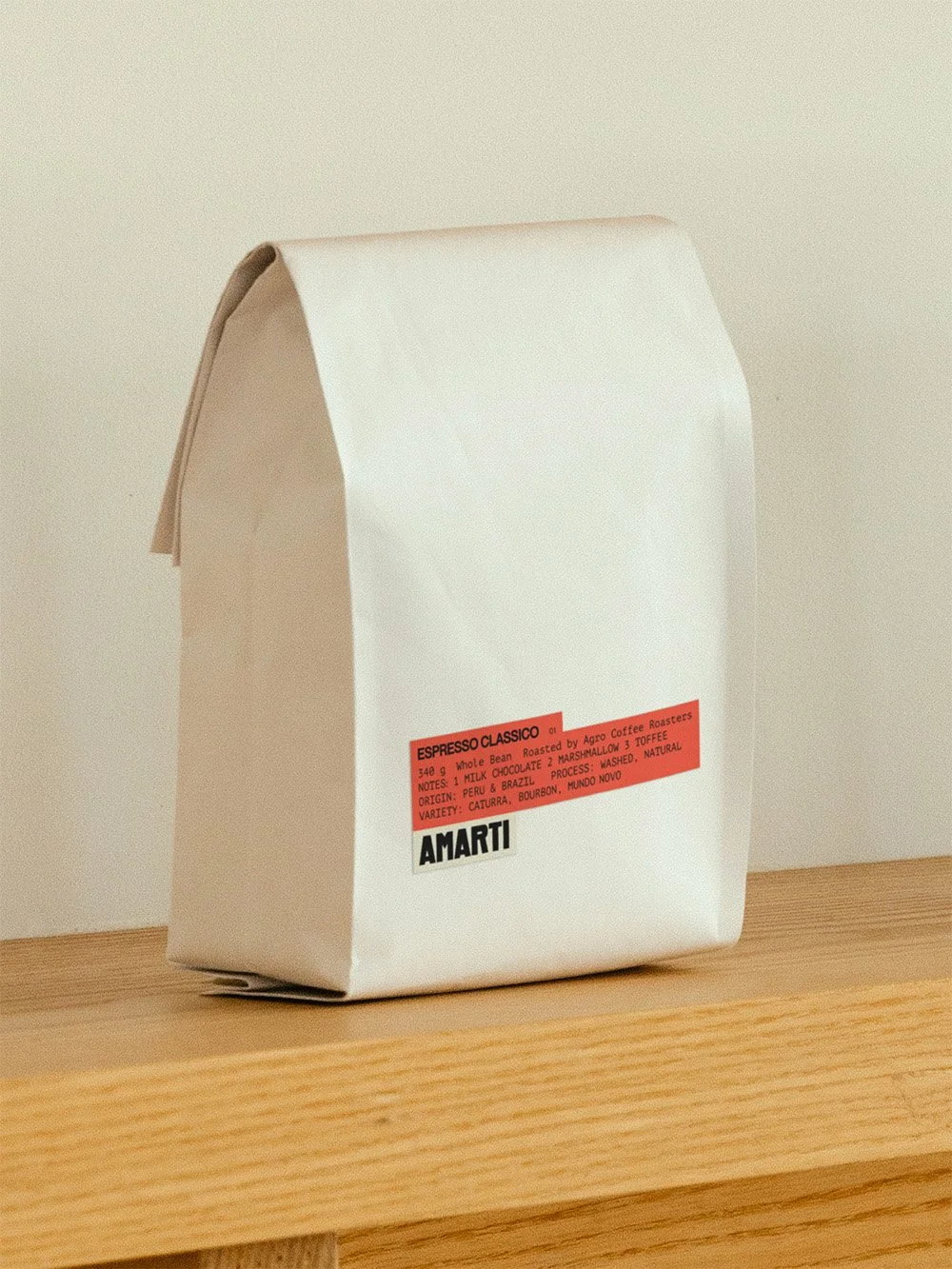
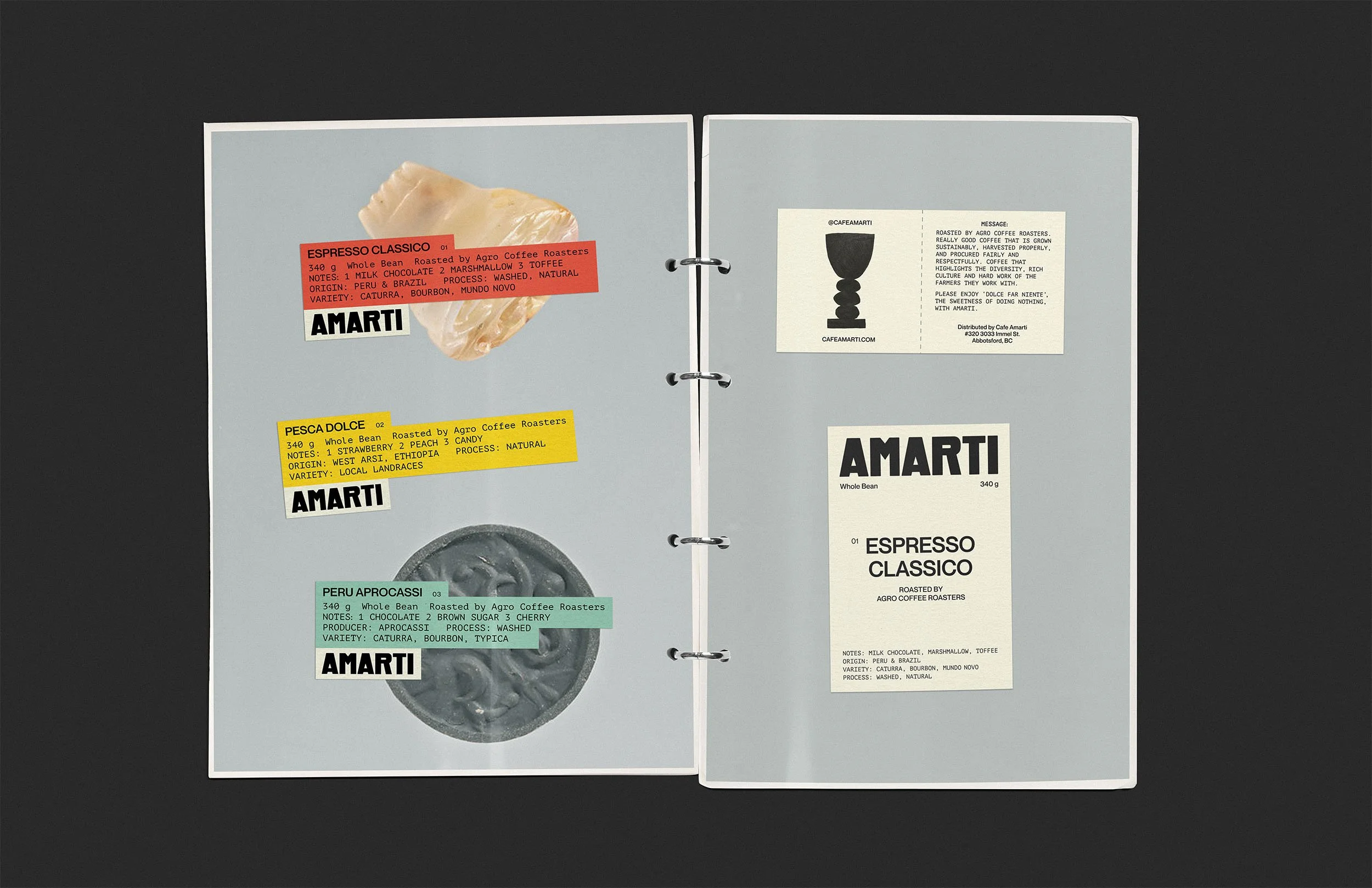
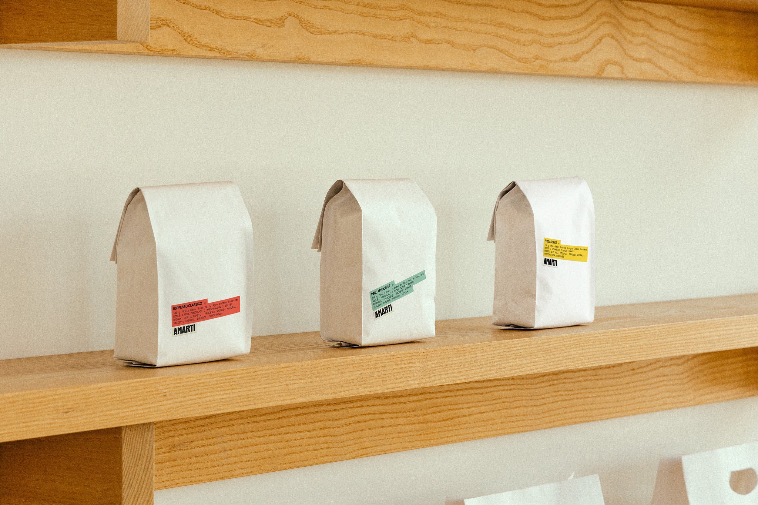
The custom coffee bean labels combine the influence of striped umbrellas on the piazza and cut up love notes for a result that is eye-catching, yet understated, while in alignment with the client’s print budget.
After 10 years as one of the most-loved cafes in their city, Amarti has rebranded.

Logo development