Art Direction, Brand Design & Development. Artifacts for connection.
Nala
Rebrand; Packaging
Industry: Beauty
Project by Arithmetic
A modular humanistic rebrand formed from emotion, efficacy and hope. Nala was born from loss and healing; the kaleidoscope, a symbol of the two founders’ personal story, became the vibrant visual language of the rebrand, an expression of joy and hope through rich colour.
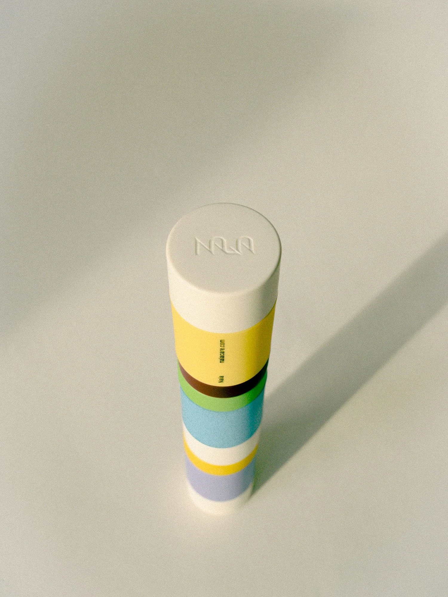
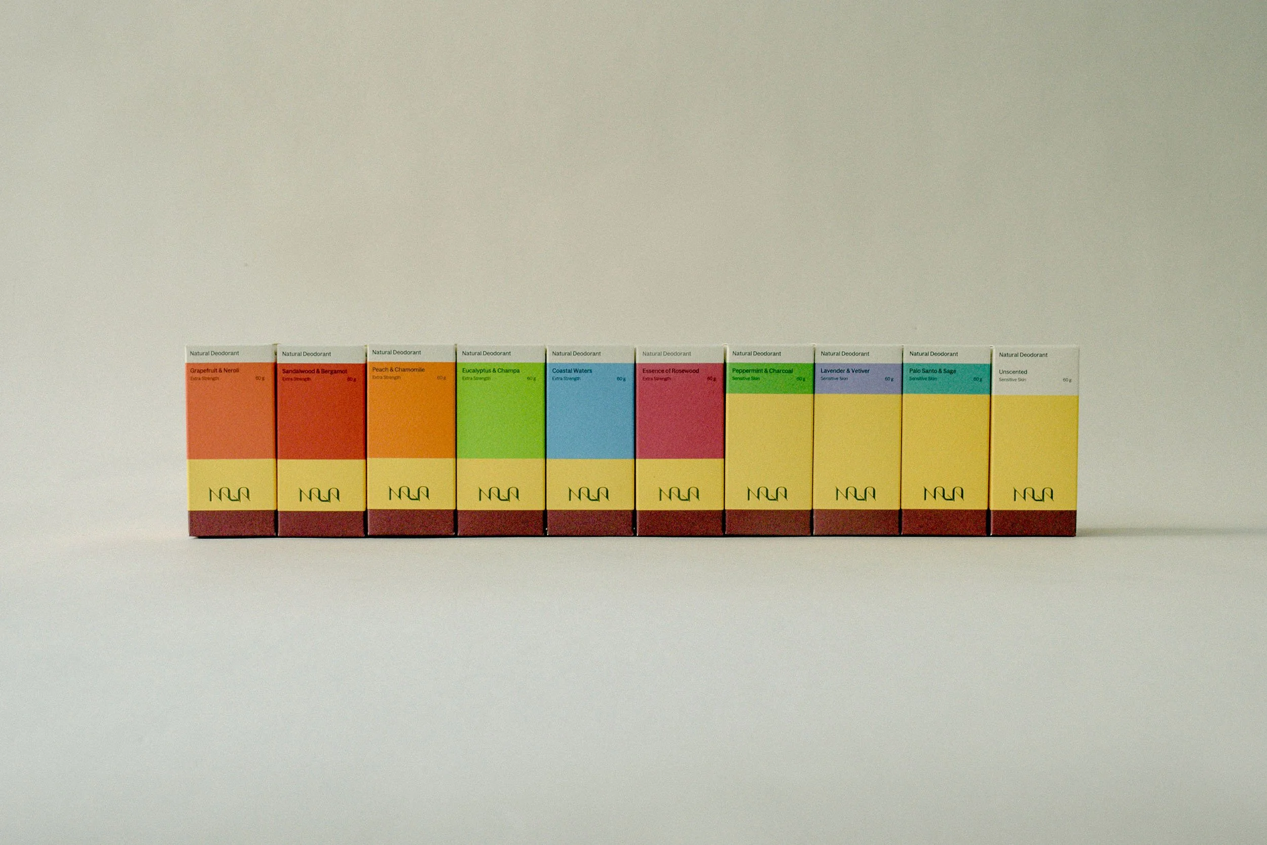
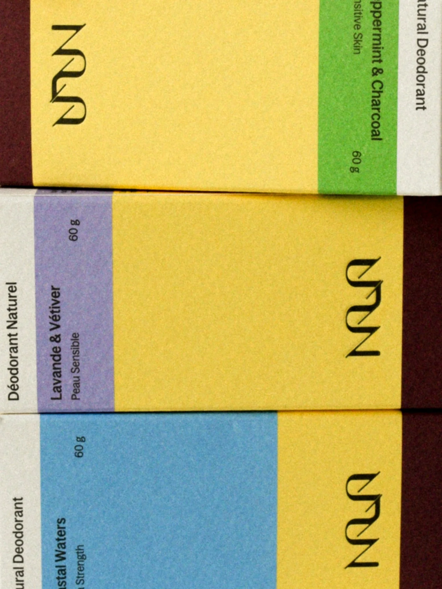
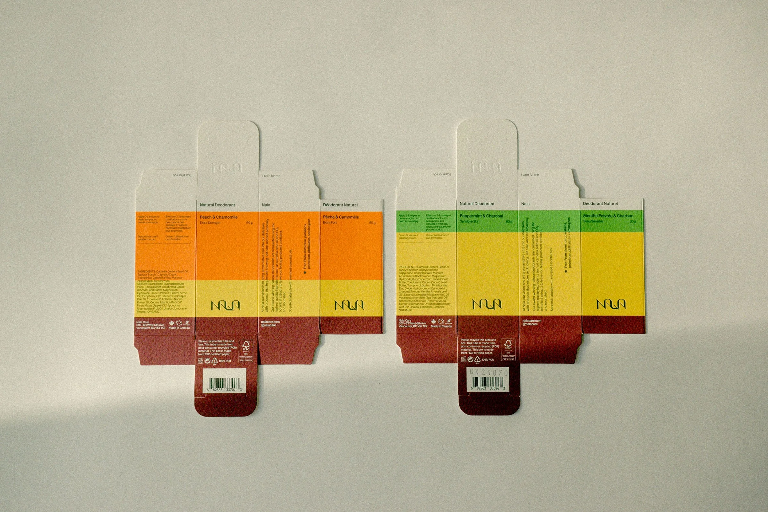
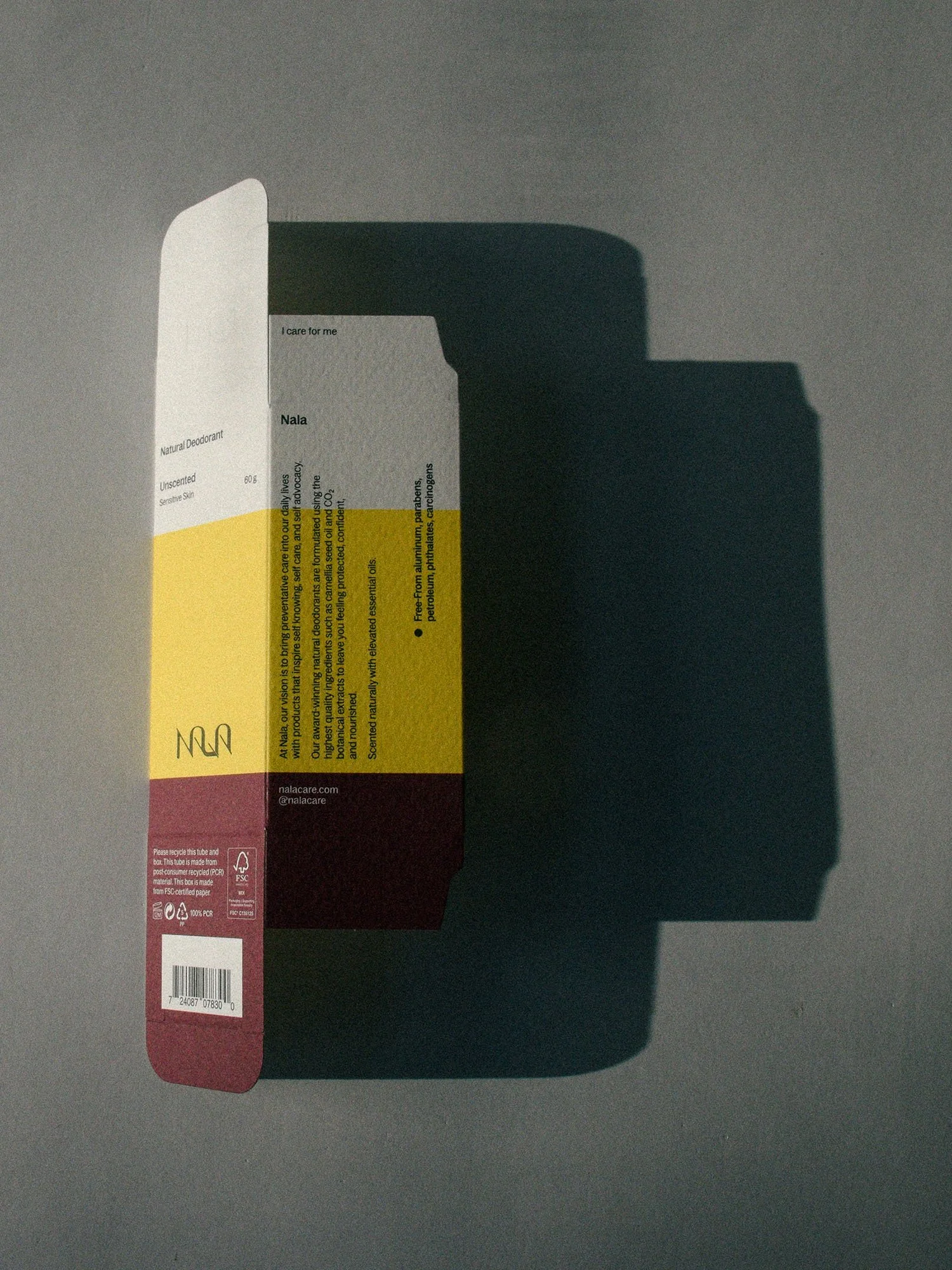
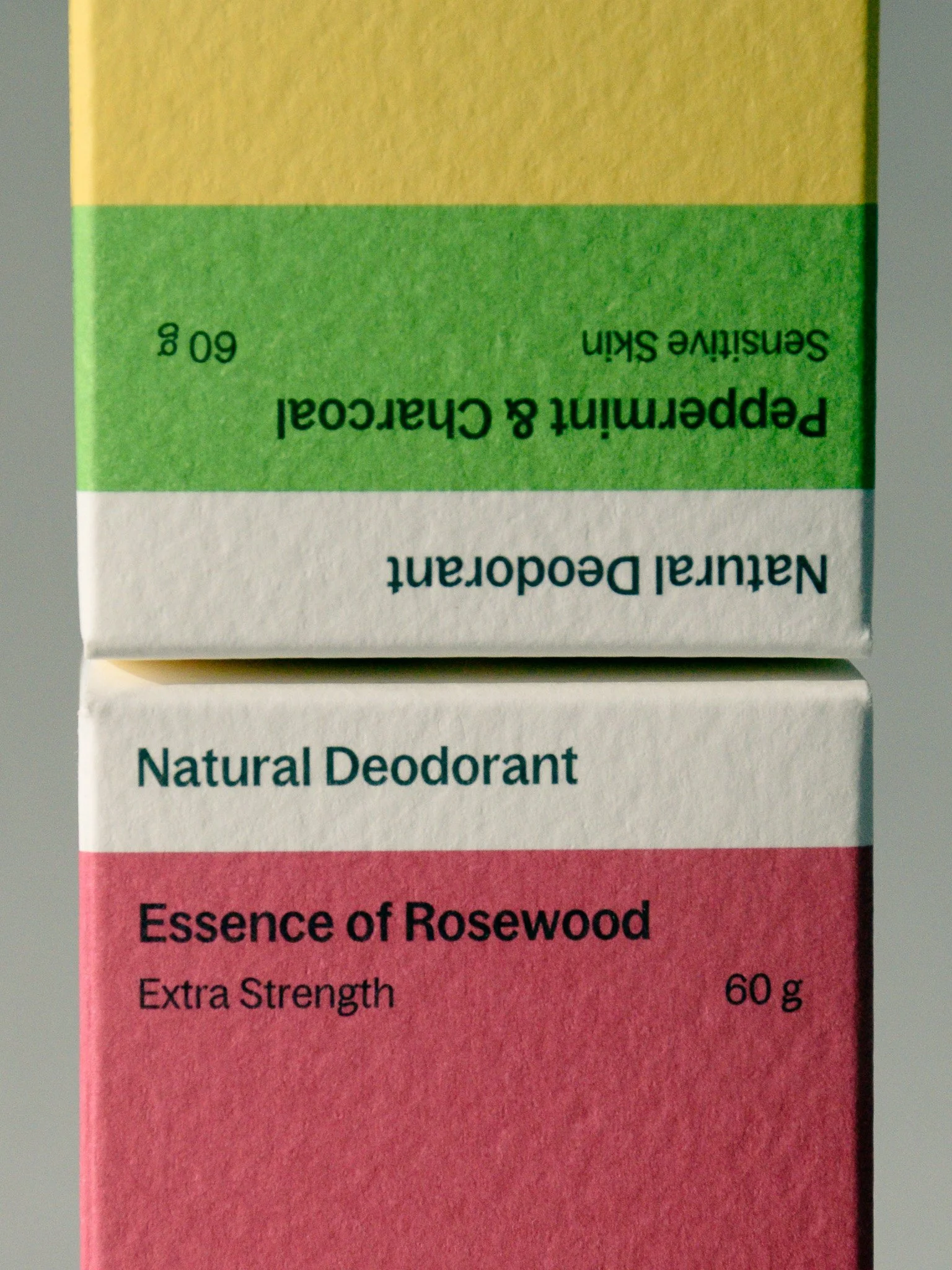
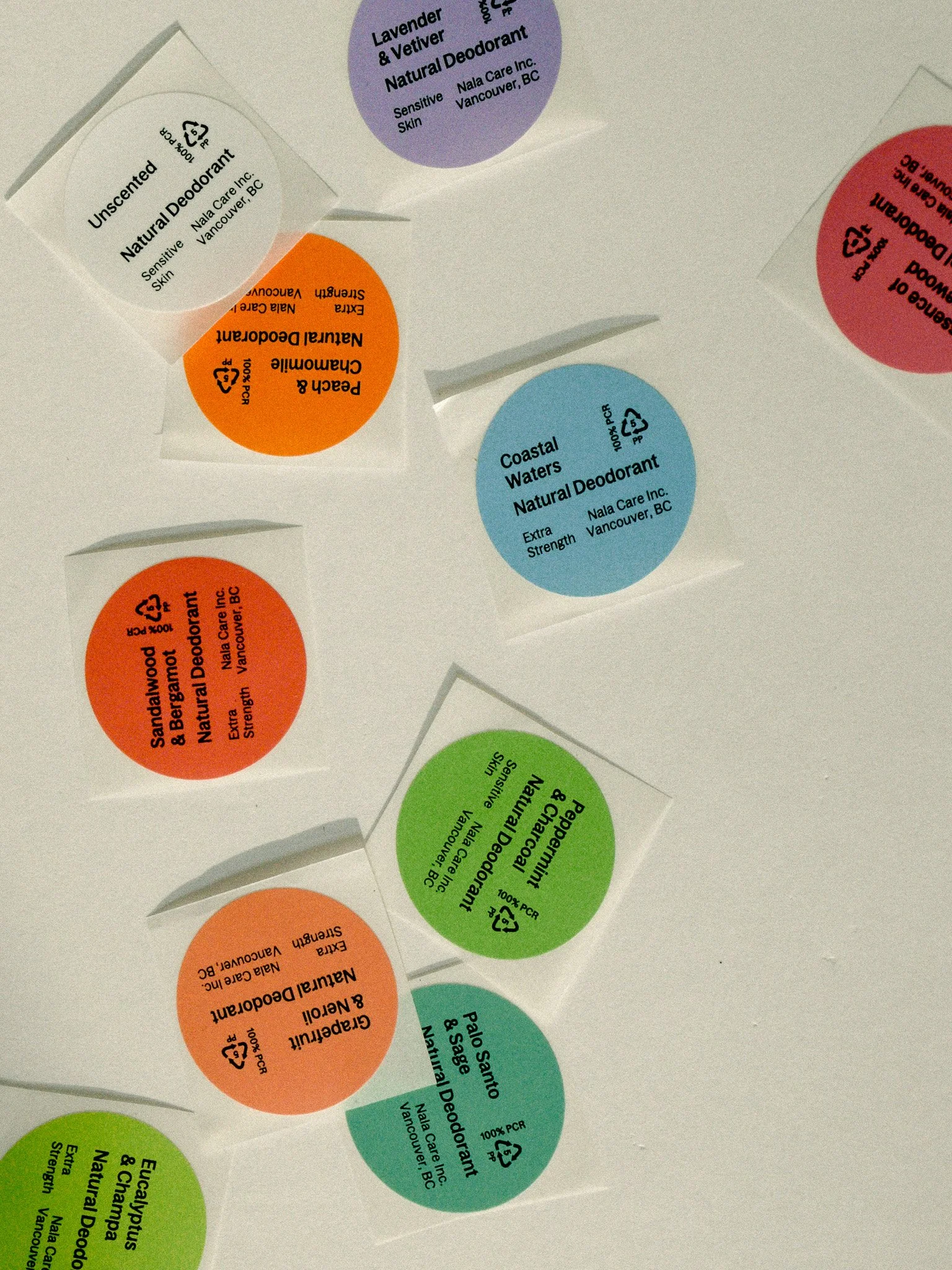
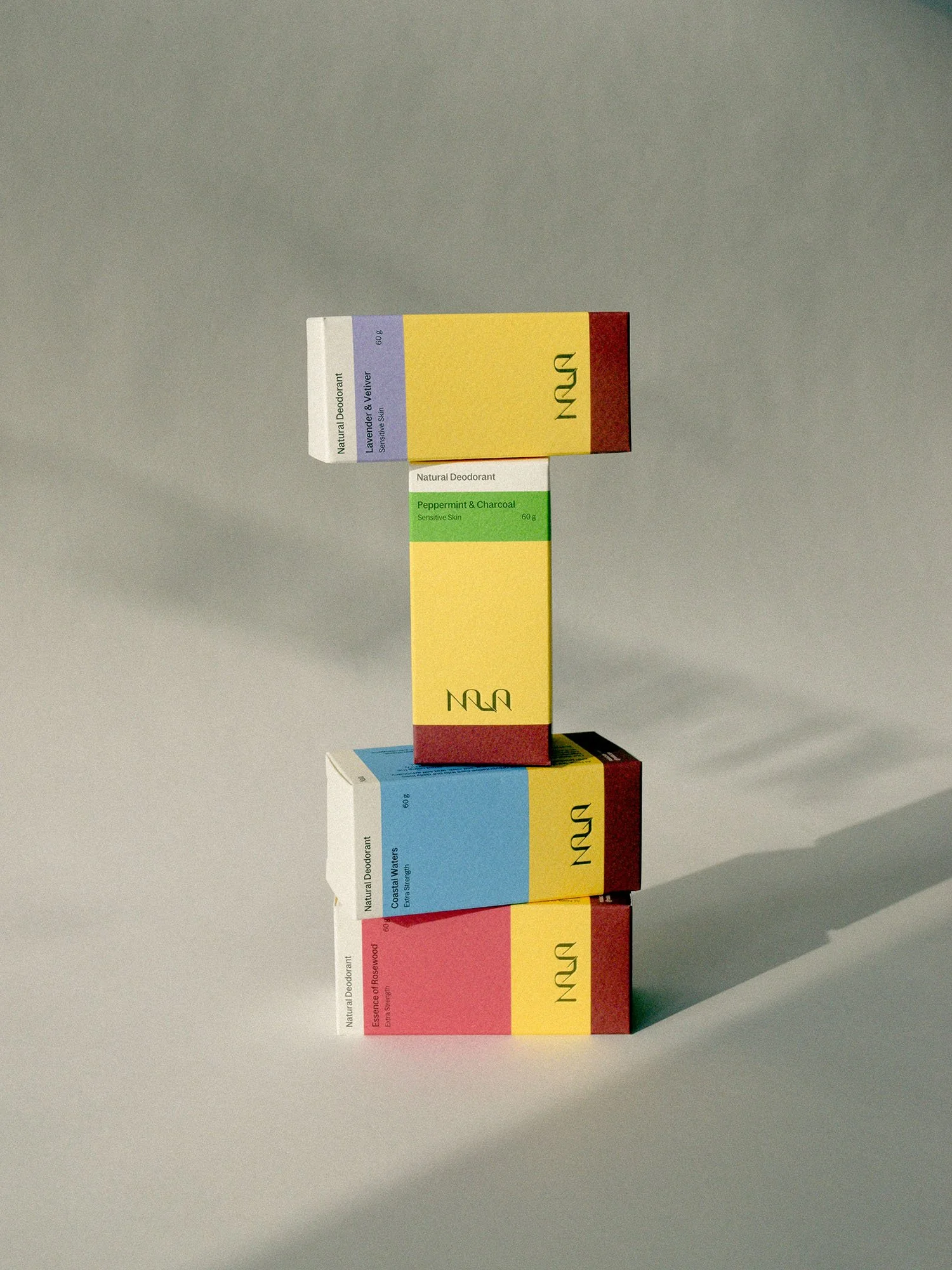
Nala’s new modular packaging features a colour blocking strategy which communicates the product strength levels at a glance, visually unites both box and vessel through ownable brand colours, presents scent differentiation between SKUs, and supports product line growth. Honouring the founder’s background in biotech engineering and dedication to free-from harmful ingredients, each box presents clear, structured and confident typography to convey efficacy and the science behind the formulations created in-house.
Sensorially rich and humanistic, the packaging is made from a carefully selected Italian-mill Fedrigoni paper that is toothy and raw to communicate the natural formulas and allows for a richness in ink colour to be captured. A deeply debossed logo is impressed in both box and vessel lids for a luxurious feel.
The sustainability-first packaging materiality is the outcome of two years of sustainability research; the final product is one of circular simplicity rather than buzz word or trend materials. Nala’s packaging is fully recyclable with a 100% post-consumer recycled PP mono-material vessel that is cost effective for brand and consumer and a box sourced from an uncoated FSC certified paper stock.
Nala is carried by ERHEWON and close to 200 retailers across North America and Asia.
AWARDS [Awarded to Arithmetic]
Silver Pentaward, Body, Health & Beauty, 2025
Silver Pentaward, Brand Identity & Connected Packaging, 2025
GDUSA Health + Wellness Design Award, 2025
Beacon Awards Nominee, Best Packaging, 2025
Project Credits: Project Credits: Creative Director: Margherita Porrà.Brand Strategy & Brand Design: Margherita Porrà Art Direction: Margherita Porrà, Sydney Mak. Designer: Sydney Mak. Logo Design: Margherita Porrà. Market Research & Strategy: Margherita Porrà, Sydney Mak. Client Management: Sydney Mak, Brooke Rosales.
Role: Packaging Design, Market Research & Strategy, Sustainable Sourcing & Production, Client Management.
2025 Deodorant boxes, vessels & SKU labels: Grapefruit & Neroli, Sandalwood & Bergamot, Peach & Chamomile, Eucalyptus & Champa, Coastal Waters, Lavender & Vetiver, Essence of Rosewood, Peppermint Charcoal, Palo Santo & Sage, Unscented.